
 Author: Emmett Hughes
This article was co-written by Emmett Hughes, our Senior Project Manager, and Carolyn Bowers, our Digital Marketing Specialist.
As time goes by, the importance of mobile website design continues to increase. People visit websites more frequently on mobile devices than on desktops, and that won’t be changing anytime soon.
- In July of 2014, we published an article that showed 33% of our client’s traffic was coming from a mobile device.
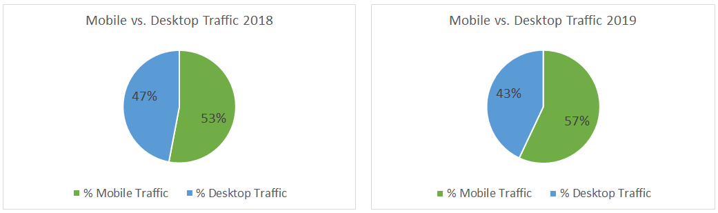
- In 2018 we published a similar article where that same number jumped to 53%.
Not surprisingly, the upward trend of mobile traffic continued into 2019.
Mobile vs. Desktop Website Traffic Changes From 2018 to 2019
We continue to closely monitor website traffic changes in the lawn and landscape industry by tracking and reviewing our clients’ mobile vs. desktop traffic year-over-year. We have some clients who provide lawn care services, some who provide design/build services, and some who provide commercial landscape maintenance services, and they all show a consistent trend of mobile traffic increasing year-over-year. Also, while the data varies slightly among our clients, the majority have more traffic coming from mobile devices than desktops.
 After compiling all of our clients’ data, we came away with the following observations:
- Mobile traffic increased by 4%, accounting for an average of 57% of all traffic in 2019 (53% in 2018)
- The median for all of our clients was 54% in 2019 (51% in 2018)
- The highest percentage of traffic from mobile for a single client was 63% in 2019
- The lowest percentage of traffic from mobile for a single client was 31% in 2019
How to Track your Mobile vs. Desktop Traffic in Google Analytics
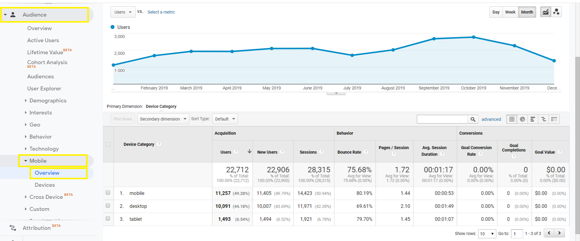
If you’re interested in how people are visiting your website (which you should be), it is pretty easy to look into. Using Google Analytics, you can not only see how many people come from mobile phones, tablets, and desktops, but you can also see what actions they take on your website.
(ACCESS NOW: Your Guide to a Kick-Ass Commercial Landscaping Website)
A Simple Process
While Google Analytics can provide you with an overwhelming amount of data, the task of finding the basic mobile vs. desktop data is pretty simple. Follow these steps:
- Login to your Google Analytics account
- Click “Audience” in the left menu
- Click “Mobile” from the options that appear below
- Click “Overview” from the options that appear below that
- Don’t forget to choose the timeframe you want to view (in the top right)
Website User Experience Is the Priority
Now that you’ve seen all these numbers you may be wondering, why does this matter?
Well, first impressions are always important, and for many businesses a website is the first impression they give to a potential customer. If someone is searching for a lawn care or landscaping company and clicks on your website in Google search results (more on that later), they are likely to develop an almost-immediate opinion of your company just by the way your website appears and functions, regardless of the device the user is on.
Consider these numbers:
- 57% of internet users say they won’t recommend a business with a poorly designed website on mobile (FormStack)
- 88% of online consumers are less likely to return to a website after a bad experience (InvisionApp)
- 80% of smartphone users are more likely to purchase from companies with mobile sites or apps that help them easily answer their questions. (Google)
Since close to 60% of those people visiting your website are likely on a mobile device, you need to make sure it looks great and functions perfectly on mobile devices.
However, we can’t forget about the people still visiting using their desktop computer.
That’s why a responsive website design is what you need. A website that appears and functions well on both mobile, desktop, and every device in between. The best way to design a responsive website is to start with how it will appear on a mobile device.
Mobile-First Design Is Also Important For SEO
Having a responsive website also has an impact on your website’s ranking on a search engine results page. In July, 2019 Google implemented “mobile-first indexing”. This means that Google looks at the mobile version of your website first when they determine where your site will rank in search results. Your website’s ranking doesn’t depend solely on this, but the lack of a mobile-friendly experience could have a negative impact on your ranking.
Time to Take Action
If you know your website isn’t mobile-friendly, it’s time to take action.
First you need to find the right website design and development company. Even though it has become crucial, some companies don’t utilize the mobile-first design approach. You need to choose a company that does. It’s also important to make sure the company is willing to listen to your opinion and understands your business industry.
If you want to learn more about our approach to website design for lawn and landscape companies you can schedule a meeting with us. If you want more insight like this you can subscribe to our blog. Just add your email address in the form below.


