Let’s say you’ve built an incredible lawn care or landscaping company. Your crews are buttoned up, your clients are happy, and the work speaks for itself.
But here’s the rub: if your brand looks like it’s been trapped in a time capsule—or worse, it’s just typical—people are making assumptions about your business before you’ve even shaken their hand.

Visual branding in the green industry is one of those things people don’t talk about enough, yet it silently influences every first impression. And trust me, they’re not always good ones.
I recently sat down with my friend John Dalton from McFarlin Stanford. He’s helped rebrand billion-dollar companies like FedEx Kinko's. We pulled back the curtain on visual branding mistakes, the missed opportunities, and the magic that happens when you get it right.
Check out the full video or audio podcast below. If you hang until the very end, you’ll even hear our pet peeves, past mistakes, and more.
Video Podcast
Audio Only Podcast
You Don’t Have a Logo. You Have a First Impression.
In our line of work, visuals matter. People pay us to transform spaces. But if your trucks, uniforms, website, and signage look like they were designed in MS Paint in 1999, it sends a message. And spoiler: it’s not being a leader in your marketplace.
John nailed it when he said, “Clarity plus consistency equals customers.”
The problem? Most companies aren’t even sure what their brand is, let alone whether it’s consistent. Your brand isn’t just your logo—it's how every piece of your visual presence works together to form a recognizable, trustworthy identity.

Landcrafters does an excellent job using two colors and bold, atypical, relevant icon in their branding. They recently changed their font to reflect a more elegant feel and will be slowly changing this on their assets.
Yet we see this all the time. Print assets using different color variations. Websites with inconsistent fonts and graphics. From trucks to social media, there’s a ton of inconsistency.
[RELATED READING: 5 Reasons Your Lawn Care & Landscaping Mailers and Print Ads “Don’t Work”]
Green, Trees, & Other Clichés We Need to Talk About
Let’s talk about the elephant in the logo: why does every landscaping company feel the need to use grass blades or trees?

We love the Monarch Landscape Management butterfly in their logo. They have a strong brand in the Houston area and this creates a memorable brand without the crutch of a leaf or tree. It also looks sharp as a solitary icon on their hats!
I get it—it’s the “green industry.” But just because you can slap a leaf next to your name doesn’t mean you should. In fact, doing so probably makes you blend in with the sea of other “leaf-named” competitors.
Over the years, we’ve worked with brands that used bold colors like pink, red, or even purple—used consistently and thoughtfully, they stood out in their markets like a perfectly edged lawn in a neighborhood full of crabgrass.

We were thrilled when Seacoast Tree Care agreed to let us use pink as their call-to-action color on their website. It really pops!
Differentiation isn’t about being weird. It’s about being memorable for the right reasons.
Fonts Have Feelings, Too
Here’s a quick typography 101:
- Serif fonts (the ones with the little “feet”) communicate tradition and elegance.
- Sans serif fonts (clean and modern) scream professionalism and simplicity.
Choosing the right font is like picking the right pavers—color, texture, and contrast matter.

We love the strength of the two fonts that Grassperson Lawn & Landscape uses. They also embrace a less-is-more perspective on the postcards we designed for them.
And whatever you do, don’t mix six different fonts in one truck wrap or postcards. That’s like trying to plant 27 different plants in a hedge row—no one knows where to look, and it all feels wrong.
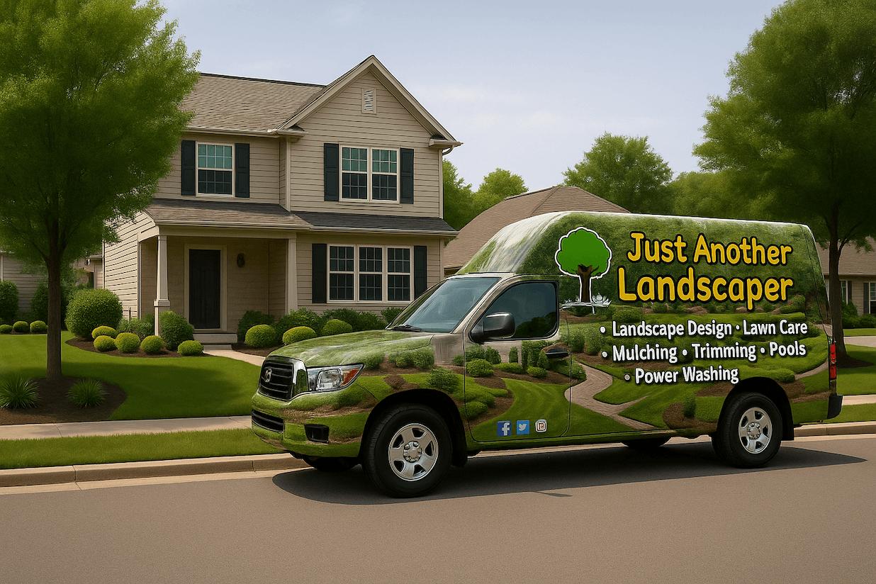
Your Truck Isn’t a Brochure
This one’s personal. I’ve made this mistake before.
Years ago, I helped design a wrap that had everything: a photo of grass, a stink bug, a spider, maybe a partridge in a pear tree. We wanted to show all our services—lawn care, tree care, pest control—and what better place than the quarter panels and tailgate?
Turns out... literally anywhere else would’ve been better.
John shared a great rule: do the “100-yard test.” Park your truck across the parking lot. If you can’t read the name or figure out what you do, the wrap’s not doing its job.
Get them to remember 1) your name 2) what you do 3) how to find you online. Then let a great website do its job.

Lawn Buddies has great branding. We love how bold the colors are on their vans and how simple the design is.
And please, no more social media icons and full URLs on your vehicle like it's 2007. People Google now. They’re not typing in www.mysuperlonglandscapename.com while in traffic.
Mascots and Characters: Cool or Taboo?
There’s a growing trend in our industry: animated mascots in logos. On one hand, it can make a brand super approachable and memorable.
We have clients with toucans, even a cartoon king named "Moe." They add a fun distinction that most residential clients will appreciate.

Kingstowne Lawn & Landscape conveys a fun, relatable brand with their mascot. They also know how to tastefully wrap their trucks with just the essential info.
However, if you’re catering to ultra-high-end clients who want classic design and prestige, a cartoon ardvark might not hit right.
Again, I love these when executed carefully and sparingly. But there’s a distinct art in pulling this off tastefully and it's not for every lawn care or landscaping company.
The Power of the Brand Style Guide
This is your secret weapon. Think of a brand style guide like your field crew’s SOP manual—but for marketing. It spells out your logo rules, font choices, color codes (CMYK and hex, please).

This is one of the pages in the Lawn & Pest Solutions brand style guide. Other pages talk about fonts and other aspects.
Whether it’s a postcard, website, or truck, your brand looks and feels consistent when you have a brand style guide.
And consistency = trust.
[RELATED READING: The Importance of a Brand Style Guide - and Why You’re Missing Out if You Don’t Have One]
Can You Rebrand Without Breaking the Bank?
Yes. But do it wisely.
Not everyone can afford to rewrap 30 trucks overnight. And you don’t have to.
John says you may not have to do what FedEx did when they bought Kinko’s—pulling it all off in a few months.

We love the simplicity and clarity of the Outback Landscape trucks and trailers.
Instead, you can phase this out over five years. Start by tightening up what’s within reach: website, uniforms, proposals, digital ads. Then build a plan for refreshing trucks as new ones come in or old ones get updated.
And hey, sometimes a brand refresh is all you need. You don’t need to toss everything—just evolve it.
Cleaner font...better spacing... modernized icon...more white space (for the love of all that’s holy, please use white space).
So... What’s Your Visual Brand Saying?
If your logo were a person, what would it sound like? Confident? Dated? Confusing? Or worse... forgettable?
Visual branding isn’t just a vanity project. It’s a credibility play. It’s a recruitment magnet. It’s the difference between someone saying, “Wow, these guys look sharp,” versus, “Meh, I’ll call the next one.”
So take a step back. Look at your trucks, your website, your proposal templates, your shirts. John says to print them all out, stick them on a wall, and ask: “Does this all look like it came from the same company?”

Oasis Turf & Tree carries over their simple yet powerful branding cohesively from vans, print, website, uniforms, and more.
If not, it’s time to clean up the brand just like you’d clean up an overgrown property.
Your brand is talking. Make sure it’s saying something worth listening to.
If you love in-depth conversations from green industry experts, consider subscribing to our blog. Like 5,000+ of your peers, you'll get new articles and episodes delivered right to your inbox. And if you're ready for a comprehensive marketing strategy at your company, request a consultation with us.